Platform Experience
The Apollo platform experience re-architecture was a design-driven initiative that began during my first week at Apollo. I noticed several issues with the navigation and overall user experience. Within two months, I designed and helped launch a new navigation system and architecture that scales with Apollo's ever-growing product offerings. This resulted in a 10% increase in customer satisfaction and improved retention.
Problem
Users
App is hard to navigate
Lack of hierarchy
Business
UX issues represent over 100K in revenue from lost deals and churned customers
Apollo being “too complex” has the 4th highest impact score among complaints -> ultimately reducing user retention and GRR
Solution
A new information architecture that aligns with the user's mental model. Making it easy to use and familiar.
+2%
+10%
2-month
Current information architecture
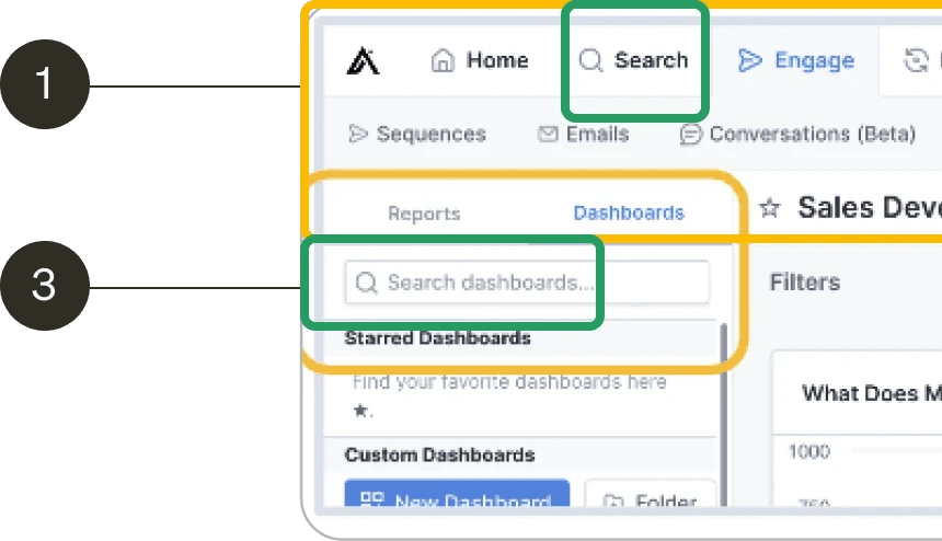
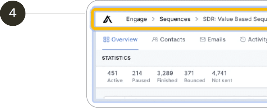
Mapping the current IA revealed system issues: a mixed-level top nav, no hierarchy between use cases, and a lack of governance for feature teams.
Tree test
Collaborated with a researcher on the tree test to reorganize navigation elements. The test didn't fully address the necessity of these items, so I consulted with Product leads for additional context.
Object Oriented UX workshop
I led an OOUX workshop with product and design leads to understand system objects and relationships, guiding the new information architecture and future projects.
New system architecture
This was the first time I was officially presenting to the CPO to show the value of this redesign. The feedback was very positive and this added to the roadmap and prioritized. I proposed a new information architecture where it clearly delineates the hierarchy: Level 0, Level 1, Level 2, Level 3
Design explorations
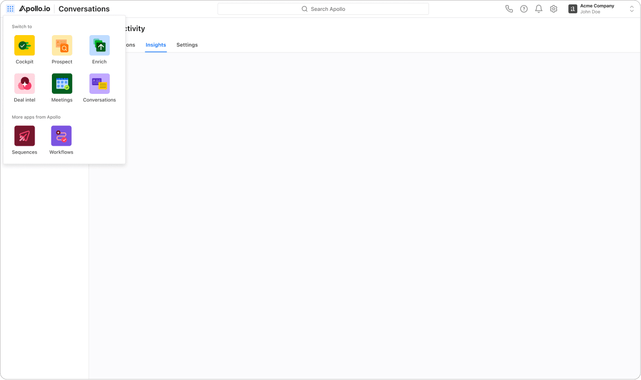
I explored multiple layouts. One concept was having all the Level 0 features under a waffle. More like an app based model, each Level 0 is it's own app. This didn't test well since it breaks the fluidity of the Sales cycle. Users commented that it was hard to discover and they had to think every time.
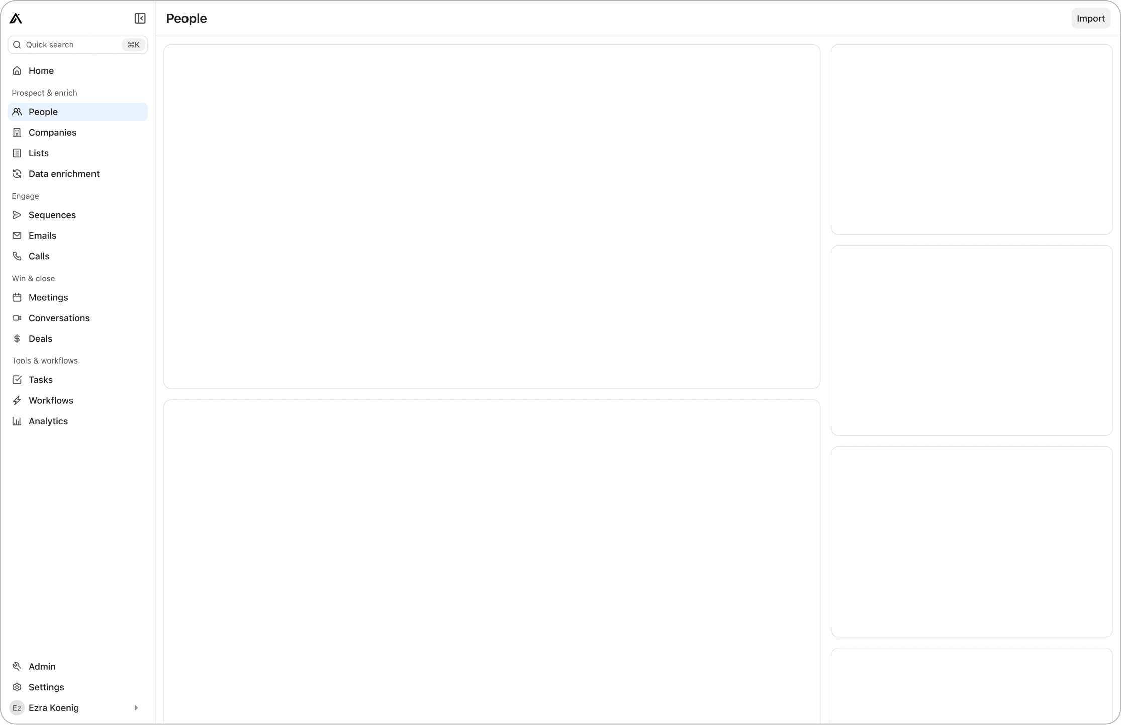
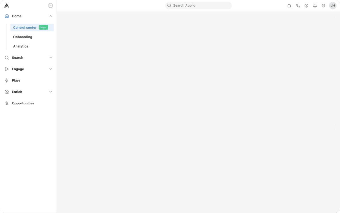
I explored left-side navigation to improve scalability and responsiveness. A collapsible version tested better. It reduced horizontal space, with users finding it intuitive and appreciating the ability to collapse/expand.
Final design
After several iterations and multiple rounds of usability testing, this was the final design.
Sections to delineate the use cases
Iconography to help with wayfinding
Removed top bar to increase vertical space
Collapsable navigation
Retrospective
Use both qualitative, quantitative data to inform the design direction
Understand the system model to also help you design the best conceptual model
Be curious and use design to inspire and influence
Other projects
Identity Governance and administration
I designed an Identity Governance and Administration platform to manage and secure identities within an organization. This was a 0-to-1 platform; we formed a new pillar, acquired a company, and had a very successful launch.
Universal Directory
Designed a scalable navigation system for the Apollo platform. Launched in two months, increasing satisfaction by 10% and retention.
