Universal Directory
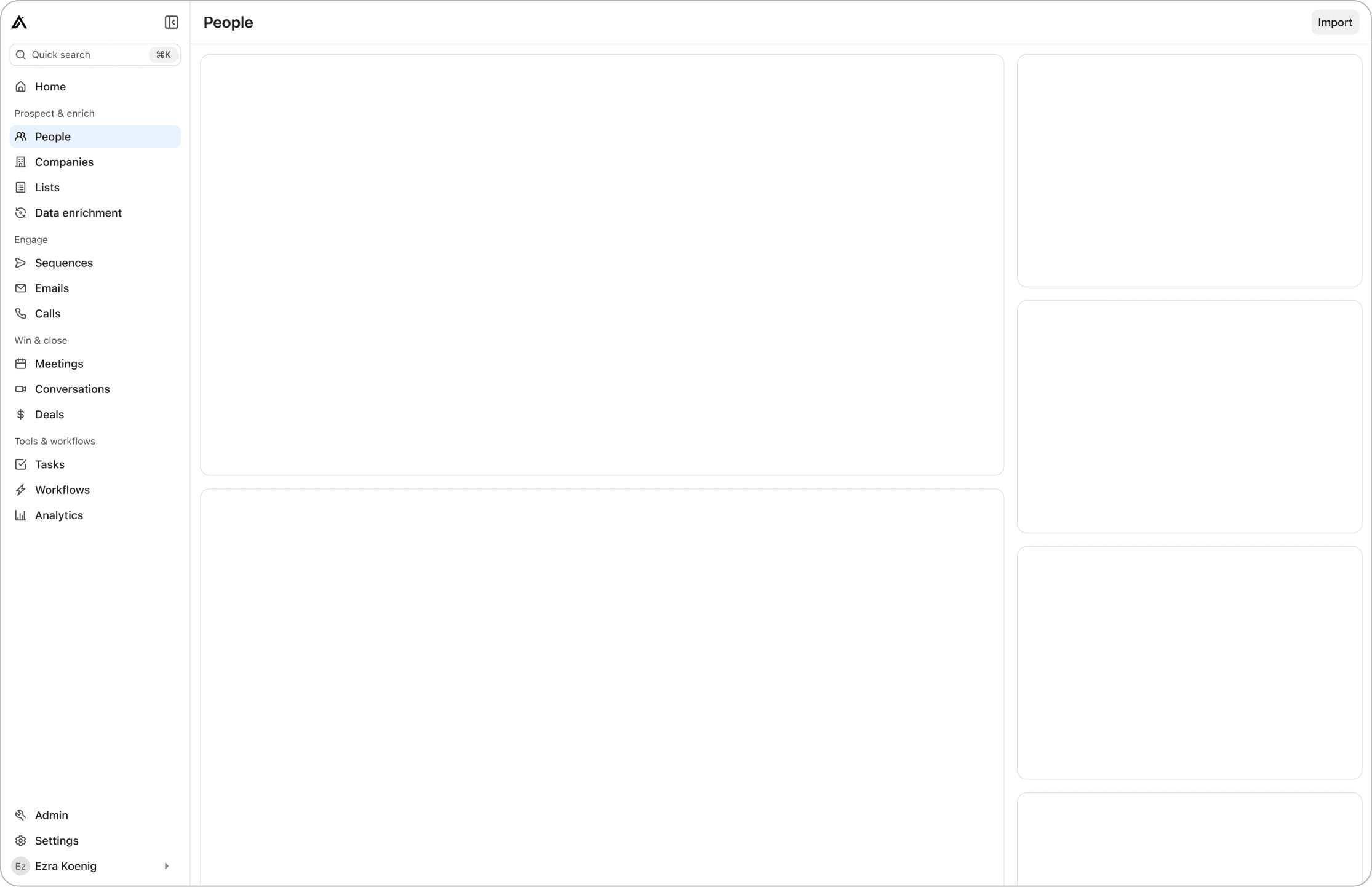
Designed a scalable navigation system for the Apollo platform. Launched in two months, increasing satisfaction by 10% and retention.
Problem
Users
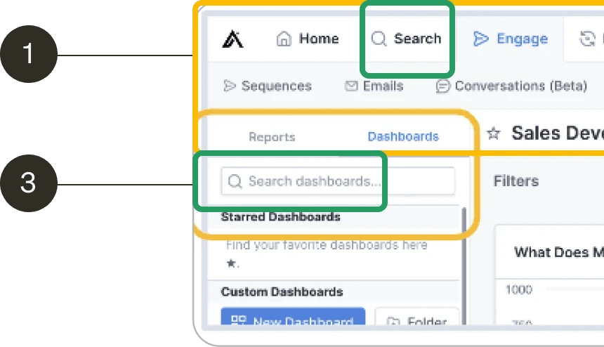
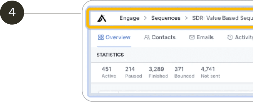
App is hard to navigate
Lack of hierarchy
Business
UX issues represent over 100K in revenue from lost deals and churned customers
Apollo being “too complex” has the 4th highest impact score among complaints -> ultimately reducing user retention and GRR
Solution
A new information architecture that aligns with the user's mental model. Making it easy to use and familiar.
Tree test
Worked with a researcher on the tree test. The researcher put together some proposals based on the patterns that we captured during the tree test. The tree test was reorganizing the current elements in the navigation but it wasn't really double-clicking on why we need to include these items. I met with the Product leads from each area to get more context on the navigation items.
Object Oriented UX workshop
It was evident that there wasn't a system in place and PMs added features to the nav to increase visibility and improve their metrics.
As the design lead, I need to understand the system better, so I ran a OOUX workshop with the product and design leads to understand the objects in the system, the relationships and the capabilities.
This initial work helped guide the new information architecture but also other future work streams, entity pages, CRM platform...
Outcomes
The redesigned fitness tracker app received overwhelmingly positive feedback from users, who praised its improved usability, engaging design, and motivational features. The project was a significant learning opportunity, enhancing my understanding of user-centric design principles and the impact of design on user behavior and app retention.
Other projects
Identity Governance and administration
I designed an Identity Governance and Administration platform to manage and secure identities within an organization. This was a 0-to-1 platform; we formed a new pillar, acquired a company, and had a very successful launch.
Platform Experience
The Apollo platform experience re-architecture was a design-driven initiative that began during my first week at Apollo. I noticed several issues with the navigation and overall user experience. Within two months, I designed and helped launch a new navigation system and architecture that scales with Apollo's ever-growing product offerings. This resulted in a 10% increase in customer satisfaction and improved retention.


